Examples
Monthly revenue dashboard
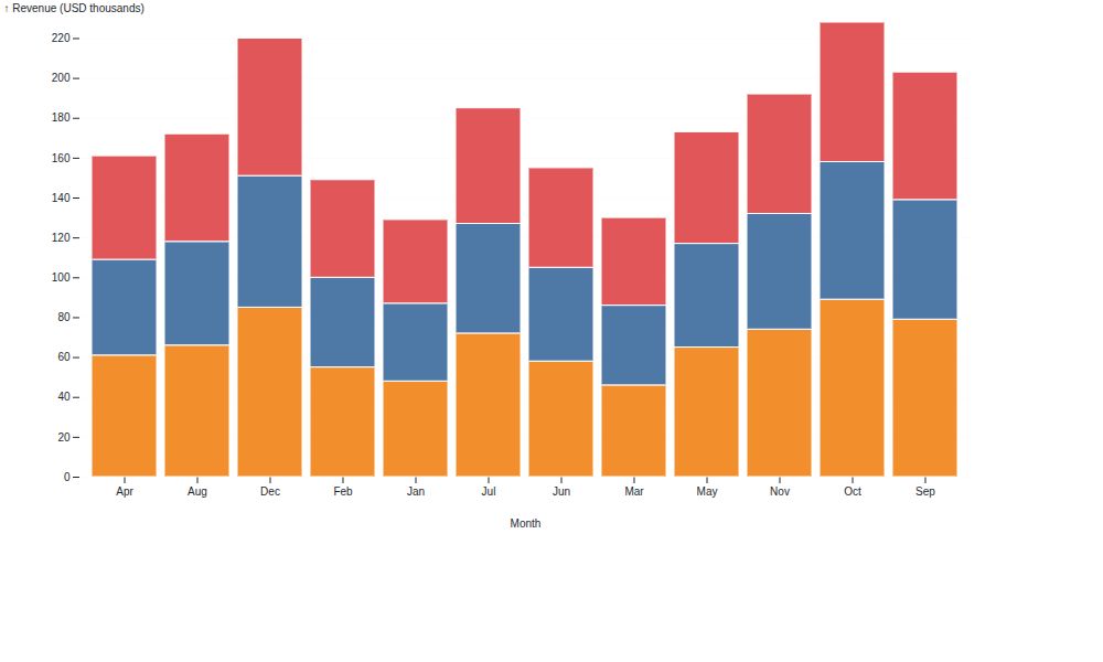
This example creates the stacked bar chart shown on the home page. It uses an in-memory DuckDB table, but the same component can use a connection that already contains your data.
import duckdb
import panel as pn

from panel_mosaic import Mosaic

pn.extension()

con = duckdb.connect()
con.execute("""
    CREATE TABLE monthly_revenue AS
    SELECT * FROM (
        VALUES
            ('Jan', 'North', 48), ('Jan', 'Central', 39), ('Jan', 'South', 42),
            ('Feb', 'North', 55), ('Feb', 'Central', 45), ('Feb', 'South', 49),
            ('Mar', 'North', 46), ('Mar', 'Central', 40), ('Mar', 'South', 44),
            ('Apr', 'North', 61), ('Apr', 'Central', 48), ('Apr', 'South', 52),
            ('May', 'North', 65), ('May', 'Central', 52), ('May', 'South', 56),
            ('Jun', 'North', 58), ('Jun', 'Central', 47), ('Jun', 'South', 50),
            ('Jul', 'North', 72), ('Jul', 'Central', 55), ('Jul', 'South', 58),
            ('Aug', 'North', 66), ('Aug', 'Central', 52), ('Aug', 'South', 54),
            ('Sep', 'North', 79), ('Sep', 'Central', 60), ('Sep', 'South', 64),
            ('Oct', 'North', 89), ('Oct', 'Central', 69), ('Oct', 'South', 70),
            ('Nov', 'North', 74), ('Nov', 'Central', 58), ('Nov', 'South', 60),
            ('Dec', 'North', 85), ('Dec', 'Central', 66), ('Dec', 'South', 69)
    ) AS t(month, region, revenue)
""")

Mosaic(
    {
        "width": 900,
        "height": 480,
        "colorScheme": "Tableau10",
        "xLabel": "Month",
        "yLabel": "Revenue (USD thousands)",
        "yGrid": "#e5e7eb",
        "plot": [{
            "mark": "barY",
            "data": {"from": "monthly_revenue"},
            "x": "month",
            "y": "revenue",
            "fill": "region",
            "stroke": "white",
            "strokeWidth": 1,
        }],
    },
    con=con,
).servable()
Save the example as app.py, then launch it with:
Interactive wind map
Mosaic features such as vector marks, linked selections, legends, inputs, and
vertically concatenated views work inside a Mosaic pane. The complete,
runnable example is available in
examples/wind_map.py.
Drag over the map or legend to filter the vectors, and use the slider to alter their length.
Use an in-memory frame
When your data is already in a pandas or PyArrow object, register it through data instead of manually creating a DuckDB table: